Case
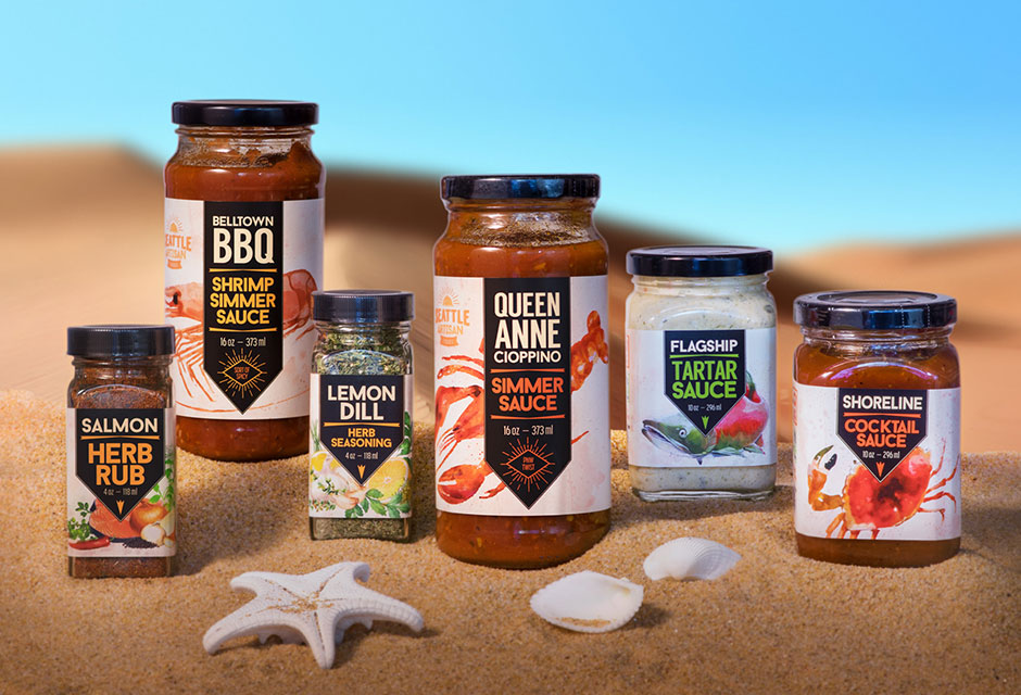
Seattle Artisan Foods is a provider of authentic, high quality seafood sauces, condiments, and seasonings. Their hand-crafted business started with small batches and catered to specialty stores in the Seattle region, but soon they were ready to take their brand to a much larger retail distribution.
Originating in the Pacific Northwest and proud of that heritage, Seattle Artisan Foods needed new packaging that could convey their story visually to shoppers while standing out on crowded grocery shelves. It was also important for Seattle Artisan Foods as a brand to evoke Seattle’s seafood culture while keeping their local, small-batch characteristics. Since the seafood cuisine industry is unique and vibrant in the Seattle area, Seattle Artisan Foods teamed with V2Works to obtain their vision of beautifully updated branding and packaging in order to gain an edge over their competition.
As a highly transparent and communicative team we set out to create a new logo, a “Fair Plate” icon, and a series of highly shop-able product labels that were retail ready.
Strategy
The objective for the Seattle Artisan Foods line of package design was to create a unique presence on supermarket shelves for a Northwest brand that had previously only been sold in small batches to specialty stores. Serving as the only visual, the label design needed to evoke the brand’s essence while also clearly declaring itself as Pacific Northwest Seafood cuisine. Seattle Artisan Foods desired a retro look and feel with their logo and seafood illustrations to elicit an old-school Seattle vibe.
Results
V2Works redesigned the Seattle Artisan Foods logo to capture the spirit of Seattle’s yesteryear, using a combination of artistic elements and fonts that hearken back to the 1962 Seattle World Fair, but kept the brand’s color scheme open, so it could conform to any product packaging design or advertising use. The updated logo drives home an artisan message and enhances communication.
For their social movement, “Fair Plate,” we created a simple icon to be used on all of their products that would represent their primary mission of “…providing products that support the people who grow it, make it, sell it, stock it, and eat it, to build goodwill and a better community.”
For their product label designs, we created detailed watercolor illustrations as a visual cue to explain what each product is, and structured each label design with legibility and ease of understanding in mind. The artistic, yet clean, design features a consistent information hierarchy to make each package easy to read, therefore making it easier for customers to shop and get cooking.
V2Works did an amazing job re-branding our products. They took the lead and ran with it, creating a fantastic new coordinated design. I am very happy with their attention to detail, and they kept us on schedule and within our budget. I highly recommend V2Works, as they exceeded all of my expectations with ease. Many Thanks to everyone at V2Works.

