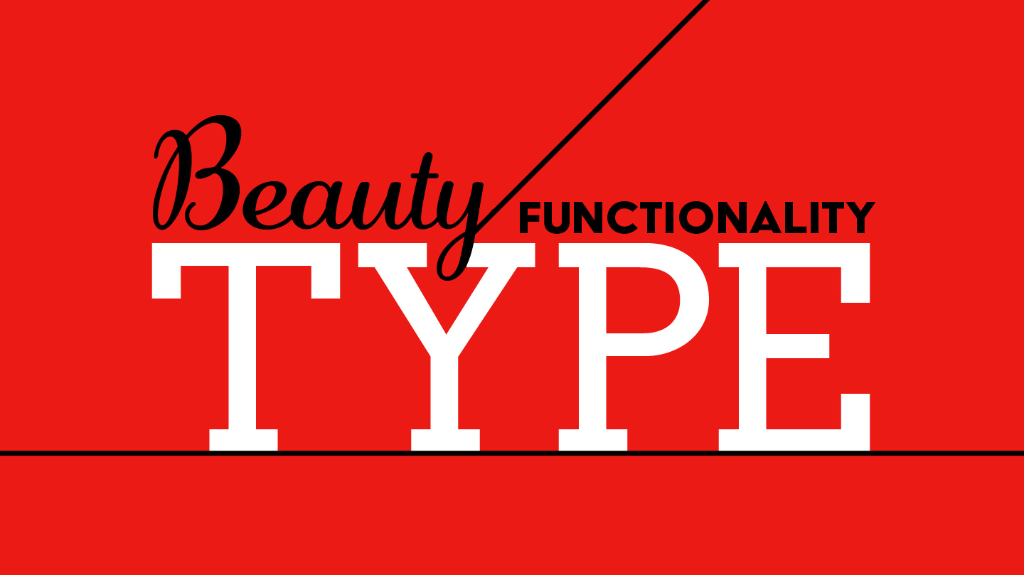
Type can get overlooked in design as being the unavoidable workhorse: something that is there to do a job and not look beautiful. But type can and should be beautiful, and an elegant means of conveying information. As with everything else, there are guidelines that should be followed that will make your copy look neat and professional and convey your message with elegance and ease. Here are some tips for making your type look its best:
Use a single space after periods.
Entering two spaces is a holdback from monospaced typewriter days. Today’s word processing programs enter enough space between a period and a first word; doubling that space will make your copy look like it’s riddled with small holes.
Don’t make your lines too many characters long.
Robert Bringhurst, author of The Elements of Typographic Style, suggests 66 characters as the ideal length, and anything from 45–75 characters a comfortable length. If the character length of a line is too long, your eye can have trouble finding the beginning of the next line when moving from right to left. If you need to fill a standard letter sized page, try using multiple columns.
Hierarchy
Keep hierarchy in mind, and use the methods to convey hierarchy consistently. Use different sized type and varying weights (of only one or two typeface families, and no more) to make your type rich and expressive and lead the viewer’s eye when scanning a document, but remember that only one item can call for the most attention. If you have too many items demanding your attention, then none command it.
More Information
Looking for more information on the web regarding type? For sites that respect and revere type, try I love Typography or the aforementioned Robert Bringhurt’s book interpreted for the web by Richard Rutter at Elements of Typographic Style Applied to the Web or Frank Chimero’s blog post on Typographic Heirarchy. Or you can just browse some type loveliness from Jessica Hische, House Industries, or Hoefler & Frere-Hones.